
Independent Technical Study · Fictional Product
Modular sofa
One collection, assembled into four layouts and four finishes.
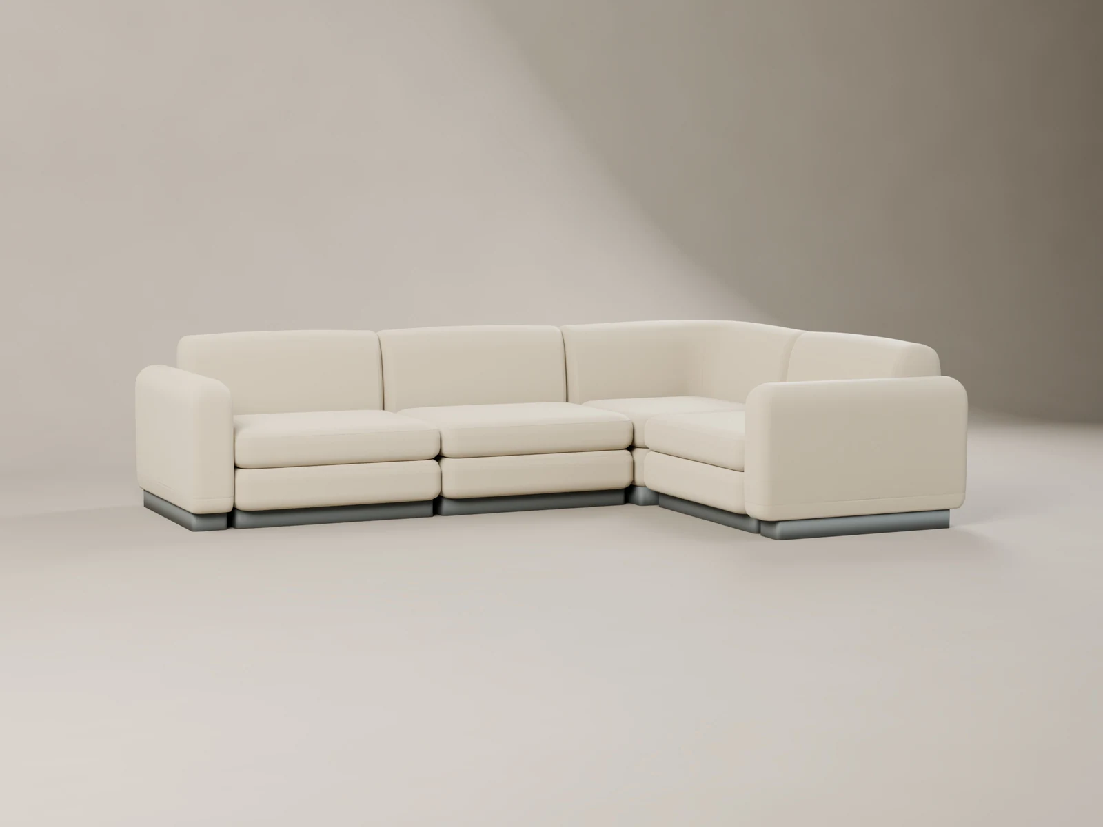
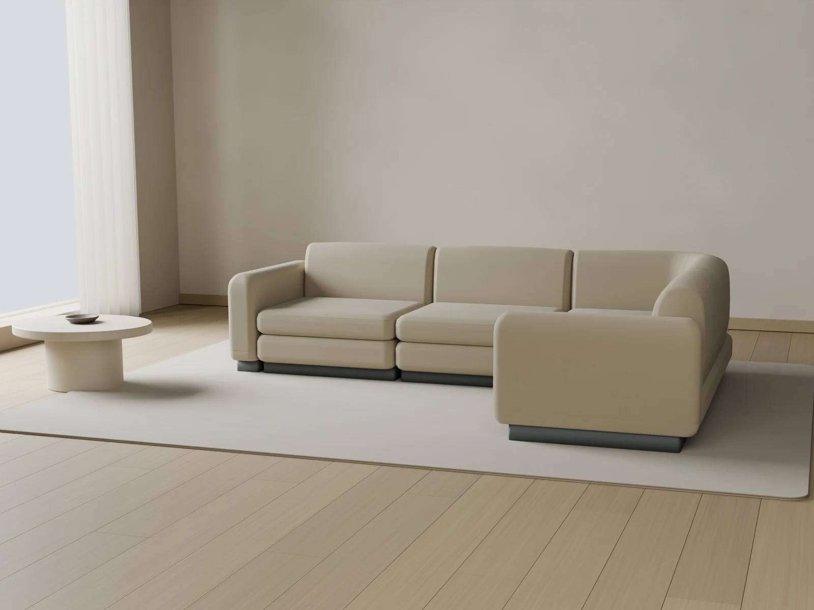
I built a modular sofa system for two kinds of viewing: considered product images and a browser configurator. Reusable parts and consistent material roles keep the collection recognizable as its layout changes.
Read the study ↓Try it yourself ↓The brief
Build a collection, one part at a time.
A modular sofa should still look like one considered product when its arrangement changes. I worked with four reusable part types—Single, Corner, Ottoman and Armrest—so the layout could change without rebuilding the whole collection.
Stable part names, pivots and assembly rules connect the product images to the browser version. The result is a fictional collection with four approved layouts and four material families.
What I worked on
- Developed the modular product structure and its four arrangements.
- Created Velvet, Linen, Leather and Mohair-like treatments.
- Prepared commercial images and optimized GLB modules.
- Connected the modules, texture sets and configuration rules to the interactive viewer.
The product system
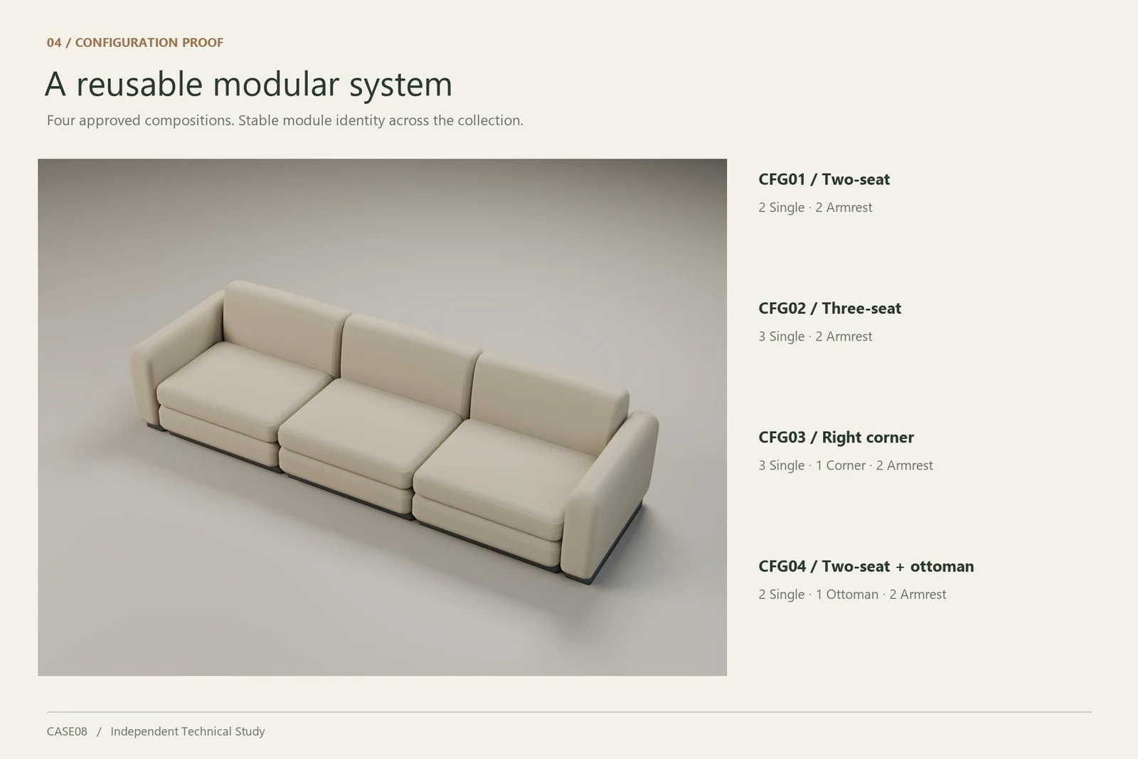
Four layouts. Shared building blocks.
A two-seat sofa, three-seat sofa, right-corner arrangement and sofa with ottoman use the same small set of modules. The configuration rules define how each part is placed.
Material identity
A different surface changes the character.
The same forms support four distinct finishes. I used the studio images to explore their texture and softness, then prepared separate PBR maps for the live viewer.
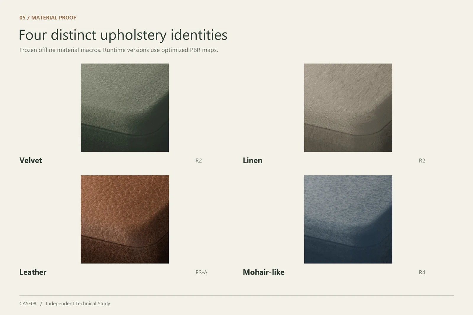
These are offline CGI images. Fibre silhouettes and some shading effects are approximated in the browser, so the live appearance differs.
Moving into the browser
Keep the choices. Adjust the asset weight.
The viewer uses MEDIUM geometry and 2K textures on a wide desktop viewport. At 850 px and below, its existing rule selects LOW geometry and 1K textures. Both profiles keep the four layouts and four material families.
The frozen v1.0 record covered all 16 layout/material combinations in local desktop Edge QA. Its narrow-screen results were desktop emulation. An Owner mobile PASS attestation exists without phone, OS, browser or performance details.
- Module types
- Single · Corner · Ottoman · Armrest
- Approved choices
- 4 layouts × 4 material families
- Wide-screen assets
- MEDIUM geometry · 2K textures
- Narrow-screen assets
- LOW geometry · 1K textures
Bouclé is deferred. The mobile attestation is not a device-specific performance benchmark.
For a similar client project
Images and a consistent system of choices.
A similar project could include:
- Commercial furniture images and finish comparisons.
- Reusable models with agreed naming, pivots and assembly rules.
- Browser assets, material maps and a configuration schema.
- A working configurator and documented handoff for a developer.
Important limits
This is an Independent Technical Study. The product concept, brand, specifications and visual identity are fictional.
It does not represent a client commission, production ecommerce integration, manufacturing certification or measured commercial outcome.
Browser PBR and offline CGI are separate rendering targets. The use of a fabric family name does not certify a physical upholstery material.
Sources & credits ↗The interactive version
Try it yourself.
Choose a layout, compare the four material families and inspect the sofa from your own angle.
- Change layout
- Change material
- Orbit and zoom
- Reset view
The viewer selects a lighter asset profile for narrow screens. Browser viewport checks and an Owner mobile attestation do not establish device-specific performance.
Sources & credits ↗